Found 46 results for "ep"
Logos (30)
View all 30


Designers (7)
View all 7
Евгения Полуэктова Москва графический дизайн · иллюстрация

Евгений Приходькин Украина/Смела Графический дизайнер, иллюстратор.

eptacn
epeshkova

Malbert KliZmovichНе судите строго, хоть мне и пох*й

layproМои релизы: Рейс 1209 (2008), Фатум (2010), Для сотен городов (Single, 2012), С.О.1 (2012), Поиск (EP, 2013)
Blogs (4)
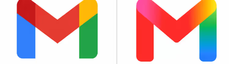
Googles Gradient GambitGoogle's leaked 2026 icon redesign signals a major visual identity overhaul, ditching flat aesthetics for AI-first gradients and 3D depth. Discover what this means for branding and how it reflects the tech giant's future direction.

AI in Logo Design: The Future is Hybrid, Not Fully AutomatedExplore how AI is reshaping logo design workflows, making initial concepts faster while solidifying the indispensable role of human creativity and strategic thinking for lasting brand identity. Discover why professional oversight remains crucial for clarity, consistency, and legal safety in an AI-po

Stitch Agent: The AI Co-Pilot Redefining Brand Identity DesignGoogle's Stitch Agent isn't just another design tool; it's a live, multimodal partner that could fundamentally reshape how identity designers work. Discover how this AI-driven collaboration accelerates prototyping, refines visual systems, and bridges the gap from concept to deployment.
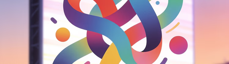
Figma's Bold Rebrand: A Cursor-less Future for Creative FreedomFigma, the ubiquitous design platform, has shed its iconic cursors and interface-heavy branding in a significant refresh. This strategic move signals a deeper evolution, embracing abstract expressiveness over literal UI metaphors, and redefining its identity as a comprehensive creative ecosystem. Di
Challenges (5)
 Closed
 #30D30L30 days 30 logos REPOST LBРаз большинство дружно кинулись постить работы для #30DAYS30LOGOS, предлагаю их публиковать под тегом челленджа.
 Closed
 #30d30l2630 days 30 logos REPOST LB 2026The challenge https://www.instagram.com/30days30logos/
 Closed
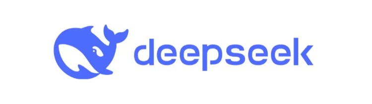
 #DeepSeekDeepSeek challengeDeepSeek has made a lot of noise and emerged as an intriguing, affordable alternative to GPT.
But what do you think about its logo? How do you feel about the font and mascot?
It seems like our community could create a more stylish and memorable version.
Let’s try to improve this logo and showcase how it could be even better!
What changes would you suggest?
--
DeepSeek наделал много шума и стал интересной, доступной альтернативой GPT.
Но что вы думаете о его логотипе? Как вам шриф
 Closed
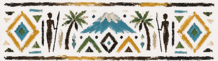
 #TZ1United Republic of Tanzania Season 1Description
Imagine United Republic of Tanzania as a global brand. What would its logo look like?
Create a modern visual identity that reflects the country's character, culture, values, nature, innovation, or future through an original logo.
This is not an official government competition. It is a creative initiative by the international design community of Logobaker, bringing together designers from around the world.
Rules
- Create an original logo designed specifically for this sea
 Active
 #inktober26Inktober 2026 REPOST LBInktober rules:
https://inktober.com/rules
1) Make a drawing in ink (you can do a pencil under-drawing if you want).
2) Post it*
3) Hashtag it with #inktober and #inktober2026
4) Repeat
Note: you can do it daily, or go the half-marathon route and post every other day, or just do the 5K and post once a week. What ever you decide, just be consistent with it. Inktober is about growing and improving and forming positive habits, so the more you’re consistent the better.
That's it