
Tinder's Bold Rebrand: Masterclass
 458
458 1
1
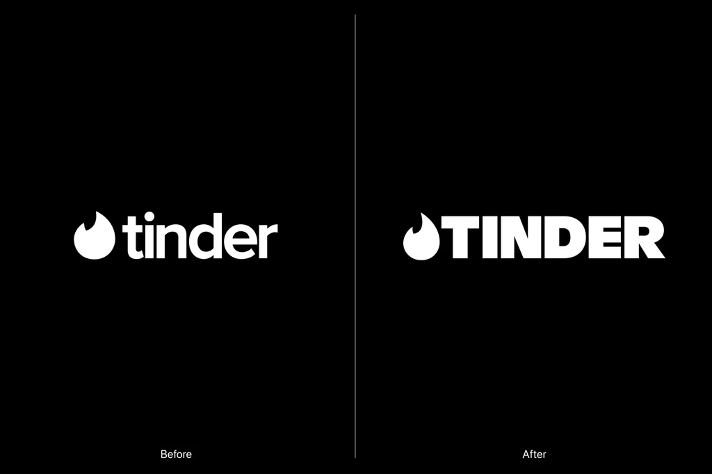
The Power of a Capital Letter
In a world where many brands are simplifying their logos to lowercase, Tinder has boldly gone the other way, ditching its familiar lowercase wordmark for an all-caps 'TINDER'. This isn't just a stylistic choice; it's a statement. The uppercase evokes a sense of maturity and confidence, signaling a brand that knows itself and its audience, moving beyond the playful, perhaps even fleeting, connotations of its earlier identity.
This shift, alongside a refined flame icon, demonstrates that powerful rebranding doesn't always require a drastic departure. Sometimes, it's about amplifying existing strengths and adjusting the tone to better reflect the brand's current stature and aspirations.
Motion as a Core Brand Element
One of the most compelling aspects of Tinder's rebrand is the integration of the iconic 'swipe' gesture into a comprehensive motion-design system. This isn't just a fancy animation; it's a brilliant way to embed the brand's core interaction into its visual language across all touchpoints.
By extending the swipe beyond the app itself, Tinder reinforces its fundamental user experience in a dynamic and memorable way. It's a prime example of designers thinking beyond static assets and embracing movement as a critical component of brand identity.
Typeface and Tone: Crafting a New Narrative
The introduction of a new serif typeface is another significant detail often overlooked but crucial for brand perception. A serif font typically conveys a sense of tradition, sophistication, and reliability – qualities that might seem counterintuitive for a dating app, yet perfectly align with a brand maturing and seeking to establish deeper connections.
Coupled with the 'happily TBD' tagline and the persona of 'T', the fictional dating columnist, Tinder is actively reshaping its narrative. It's moving away from the fairytale ending towards a more realistic, yet still optimistic, view of modern relationships. This nuanced approach shows how every design choice, from font to messaging, contributes to the overarching brand story.
Lessons for the Design Community
Tinder's rebrand is a masterclass in evolutionary design. It proves that a brand refresh doesn't always demand a radical overhaul. Instead, strategic adjustments to typography, icon refinement, and the thoughtful integration of motion can breathe new life and purpose into an established identity.
For designers, this signals the importance of understanding a brand's heritage while simultaneously pushing its boundaries. It's about finding that sweet spot where familiarity meets fresh perspective, ensuring the brand remains relevant and resonant with its evolving audience.
Source: Original article
Comments:
Open For all