
Affinity's Rebrand: The Art of Humanizing a Technical Tool
 199
199 2
2
Beyond the Pixels: A Shift in Identity
In a digital landscape often dominated by sleek, sterile interfaces, the recent rebrand of Affinity by Studio Bold.af offers a refreshing change. No longer content with merely being a powerhouse of technical precision, Affinity, now under Canva's wing, has embraced a new identity that champions personality and creative flair.
This isn't just a cosmetic update; it's a strategic pivot. The goal was to transform Affinity from a purely functional tool into a vibrant, community-centric platform. By infusing its visual language with warmth and expressiveness, the rebrand aims to make sophisticated design software feel more approachable and inspiring to a broader audience of creatives.
The Palette of Personality: More Than Just Colors
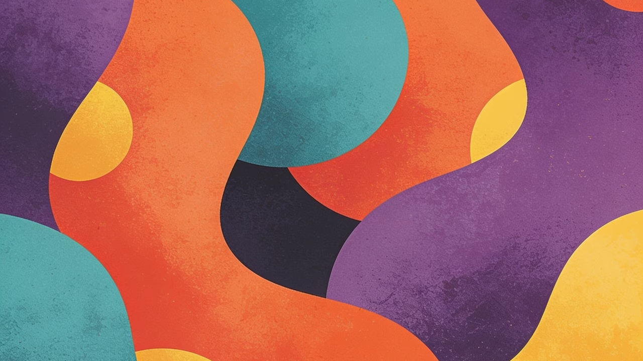
The most striking element of the rebrand is undoubtedly its expanded color palette. Moving away from a more subdued aesthetic, the new colors are bold and dynamic, mirroring the diverse and often experimental nature of the design process itself. This shift helps to convey a sense of energy and possibility, inviting users to explore their creativity without inhibition.
Complementing the vibrant colors are custom typography and a more illustrative style. These elements work in concert to tell a story – one of creativity, collaboration, and the joy of making. It's a thoughtful blend that maintains professional rigor while injecting a much-needed dose of artistic warmth, demonstrating that powerful software can also have a strong, engaging character.
Community at the Core: Designing for Connection
The rebrand’s success lies in its understanding of the modern designer. In today's interconnected world, creative tools are more than just utilities; they are hubs for communities. Affinity's new identity reflects this, fostering a sense of belonging and encouraging user engagement. It’s about building a brand that feels like a creative partner, not just a set of features.
The positive public reception underscores this point. Designers are applauding the balance achieved – a rebrand that respects Affinity's heritage of precision while boldly stepping into a more expressive, human-centered future. This case study is a powerful reminder that even the most technical products can benefit immensely from a personality-driven identity.
Lessons for the Design World
This rebrand serves as an important lesson for any brand looking to connect with its audience on a deeper level. It demonstrates that humanizing a technical product through thoughtful identity work isn't just possible, it's essential in a competitive market. By embracing personality, Affinity has not only refreshed its look but also strengthened its position as an inspiring platform for designers everywhere.
The strategic move by Bold.af and Affinity highlights a growing trend: design tools are evolving beyond mere functionality to become aspirational brands that foster creativity and community. This rebrand is a prime example of how to successfully navigate that evolution, blending professional excellence with genuine artistic spirit.
Source: Original article
Comments:
Open For all